Intro:
Investing in the stock market is all about timing. The Market Health tool helps you assess the market's current direction — whether it's trending up, down, or moving sideways. By understanding the overall market trend, you can make more informed decisions and significantly improve your chances of picking winning stocks.
Why the Market Trend Matters for Investors
The key to successful stock picking is knowing when to invest. Your chances of selecting high-performing stocks are much better when the market is trending upwards. If the market is on a downward slope, even the best stocks may struggle to perform.
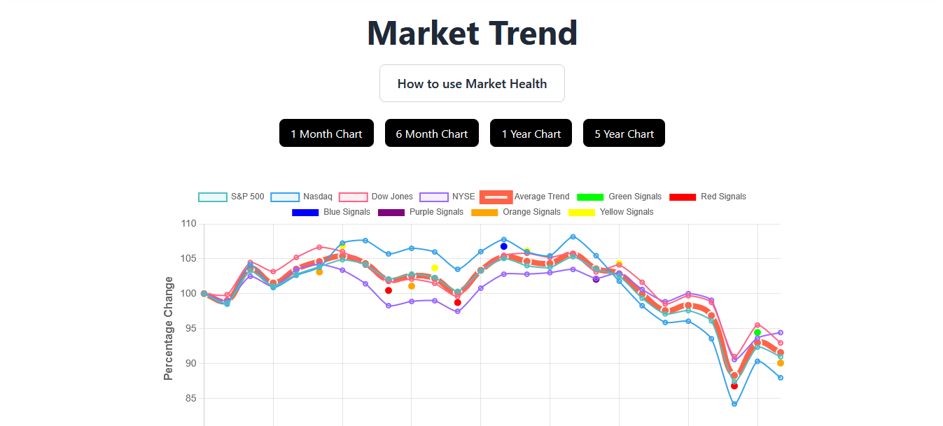
The Market Health tool gives you the insights you need to determine whether it's the right time to invest. It does this by plotting an average market trend line based on price and volume data from major market indices, such as:
-
S&P 500
-
Nasdaq
-
Dow Jones
-
NYSE
Understand Market Trends with Interactive Charts
With the interactive Market Health chart, you can see a clear, visual representation of market trends. The orange trend line indicates the overall market movement, while the chart allows you to toggle between different indices and compare them side by side.
You can also switch between different timeframes, such as:
-
1 month
-
6 months
-
1 year
-
5 years
This gives you a comprehensive view of both short-term and long-term market trends to help you make better investment decisions.
Key Insights and Real-Time Data
When you hover over any point on the chart, you'll get immediate details about price and volume changes for that specific time period. This makes it easy to spot important shifts in the market, empowering you to act quickly.
The chart also includes colored dots, each representing unique combinations of price and volume movements. You can customize these dots to highlight the data that’s most relevant to your strategy. A legend at the bottom explains the meaning of each dot color, helping you understand exactly what’s going on in the market.
Gold Plan Exclusive: Access to Historical Market Data
For Gold plan members, the Historical Charts section offers access to detailed market trends from the past 30+ years. You can filter these charts by:
-
Dot color (to identify specific market conditions)
-
Market direction (up, down, or sideways)
-
Major market crashes (to study past scenarios and patterns)
This powerful feature allows you to analyze how the market behaved during various historical events, giving you deeper insights into market cycles.
How the Market Health Tool Fits into Your Investment Strategy
After analyzing the overall market trend, you can move on to the stock screener, where we help you find stocks that align with the current market conditions. Whether the market is in an uptrend or downtrend, the right stock picks become much clearer when the market trend is on your side.
Conclusion: Start Making Smarter Investment Decisions
With the Market Health tool, you get all the insights you need to make better investment choices. By tracking market trends and understanding the broader direction of the market, you can increase your chances of success in the stock market.
Ready to take control of your investing journey? Start using the Market Health tool today and get a clear view of the market’s direction.